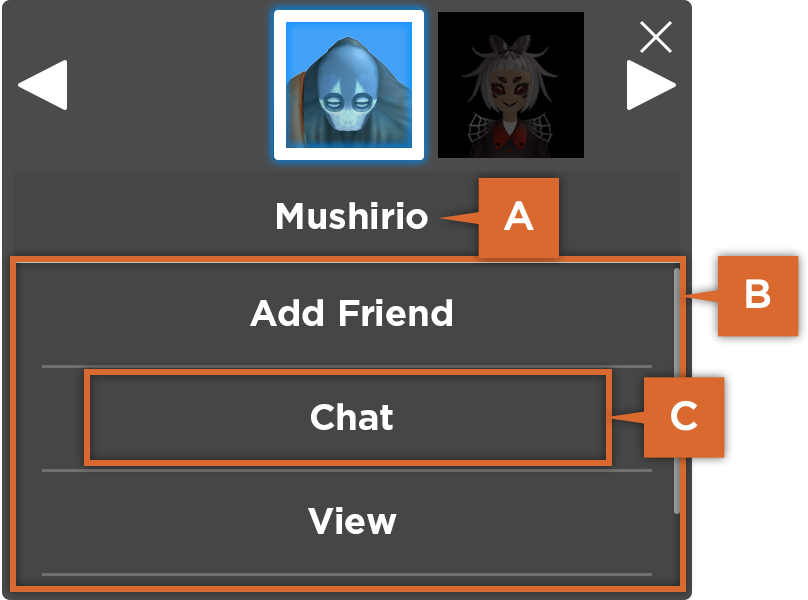
The Avatar Context Menu (ACM) makes it easier for users to interact with each other. When the ACM is enabled in your experience, a user can walk up to another user's character and click on them to open a small menu with several default options. The player can send a friend request, begin a private chat, view the user's profile, or wave.
After enabling the ACM in your experience, you can customize the ACM in the following ways:
- Programmatically open and close the ACM for specific users.
- Customize the ACM appearance to create a unique user interface.
Enabling the Avatar Context Menu
The Avatar Context Menu must be enabled using the StarterGui:SetCore() option "AvatarContextMenuEnabled" in a LocalScript. The ACM is best used in experiences where there is no predefined behavior for clicking on other users.
Use the following code sample to enable the ACM in a LocalScript:
If you need to detect whether the ACM is enabled, you can use the following code to return a boolean on the current status of the ACM:
Opening and Closing the ACM
Once enabled, you can open and close the ACM programmatically with StarterGui.
To programmatically open the ACM, use the following code:
To programmatically close the ACM, use the following code:
Menu Options
You can add and remove actions through scripting. By default, the menu has the following options:
| Menu Option | Description |
|---|---|
| Friend | Sends a friend request to the selected user. |
| Chat | Opens a private conversation with the selected user in the in-experience chat. |
| View | Opens a window to inspect the selected user's appearance. |
| Wave | Initiates a wave animation to the selected user. |
Once the ACM is open, the user can scroll and select other users on the character selection carousel. Characters are sorted based on distance to the selected character. The menu only updates when opened and the list of available users will repeat when scrolling.

Adding Menu Options
Once enabled, experience-specific actions can be added to the ACM. For example, an experience might allow for trade requests, add-to-party options, or other special interactions.
The following example shows how to add a custom action to the Avatar Context Menu:
local Players = game:GetService("Players")
local StarterGui = game:GetService("StarterGui")
local player = Players.LocalPlayer

-- Connect a function to a "BindableEvent"
local bindableEvent = Instance.new("BindableEvent")
local function onCustomACMAction(targetPlayer)
  -- At this point, you could call InvokeServer() on a RemoteFunction to alert the server of the selection
  print("ACM event selected by " .. player.Name .. " on " .. targetPlayer.Name)
end
bindableEvent.Event:Connect(onCustomACMAction)

-- Add the ACM option using SetCore() with "AddAvatarContextMenuOption"
local options = {"Custom ACM Action", bindableEvent}
StarterGui:SetCore("AddAvatarContextMenuOption", options)
Removing Menu Options
You can remove custom and the default Add Friend, Chat, View, and Wave options from the ACM by referencing the custom Action name or the default Enum.AvatarContextMenuOption enum.
Use the following code to remove a default and custom menu option:
Customizing Menu Appearance
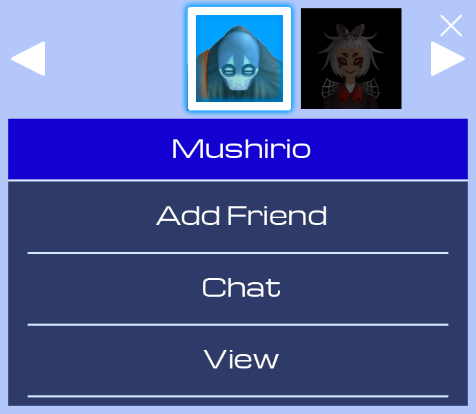
To change the appearance of the Avatar Context Menu, call StarterGui:SetCore() with the option "AvatarContextMenuTheme", providing a table of parameters and values to adjust the menu appearance.
The ACM user interface includes the following sections:

A. Name Tag: The user name of the character being interacted with.
B. Button Frame: Contains all of the ACM buttons.
C. Buttons: Individual buttons for the default or custom ACM actions.
Appearance Parameters
These are the customization parameters with the ACM:
Background
| BackgroundColor | A Color3 for the overall background of the ACM (most useful when not using a background image). |
| BackgroundTransparency | Transparency value (0–1) for the overall background of the ACM (most useful when not using a background image). |
| BackgroundImage | A valid asset ID of an image for the ACM background. |
| BackgroundImageTransparency | Transparency value (0–1) for the background image. |
| BackgroundImageScaleType | A Enum.ScaleType enum for background image scaling. |
| BackgroundImageSliceCenter | A Rect specifying the center of a nine-slice image when BackgroundImageScaleType is set to Enum.ScaleType.Slice. |
Name Tag
| NameTagColor | A Color3 for the bar showing which player is being interacted with. |
| NameUnderlineColor | A Color3 for the thin line between the name tag and action buttons. |
Button Frame
| ButtonFrameColor | A Color3 for the section (frame) containing the action buttons. |
| ButtonFrameTransparency | Transparency value (0–1) for the button frame section. |
Button
| ButtonColor | A Color3 for the background of the ACM action buttons. |
| ButtonTransparency | Transparency value (0–1) for the background color of the action buttons. |
| ButtonHoverColor | A Color3 for the "hover" state of the action buttons. |
| ButtonHoverTransparency | Transparency value (0–1) for the "hover" color of the action buttons. |
| ButtonUnderlineColor | A Color3 for the thin line which separates each action button. |
| ButtonImage | A valid asset ID of an image for the background of buttons. |
| ButtonImageScaleType | A Enum.ScaleType enum for button image scaling. |
| ButtonImageSliceCenter | A Rect specifying the center of a nine-slice image when ButtonImageScaleType is set to Enum.ScaleType.Slice. |
Text
| Font | A Enum.Font enum value for the name tag and button text. |
| TextColor | A Color3 for all text within the ACM. |
| TextScale | A float value to scale the default text sizes of each element. |
Various Image
| LeaveMenuImage | An asset ID of an image for the ACM close button. |
| ScrollLeftImage | An asset ID of an image for the carousel "scroll left" button. |
| ScrollRightImage | A valid asset ID of an image for the carousel "scroll right" button. |
Selected Character
| SelectedCharacterIndicator | The MeshPart which floats above a character's head to indicate they are selected. |
Size and Position
| Size | A UDim2 for the overall size of the ACM. |
| MinSize | A Vector2 specifying the minimum size of the ACM. |
| MaxSize | A Vector2 specifying the maximum size of the ACM. |
| AspectRatio | A float value specifying the relative width and height of the ACM. |
| AnchorPoint | The AnchorPoint of the ACM. |
| OnScreenPosition | A UDim2 specifying the on-screen position of the ACM (the position where it tweens to when opened). |
| OffScreenPosition | A UDim2 specifying the off-screen position of the ACM (the position where it tweens from/to when opened/closed). |
Example Customization
The following code sample customizes the ACM theme using some basic parameters:
